
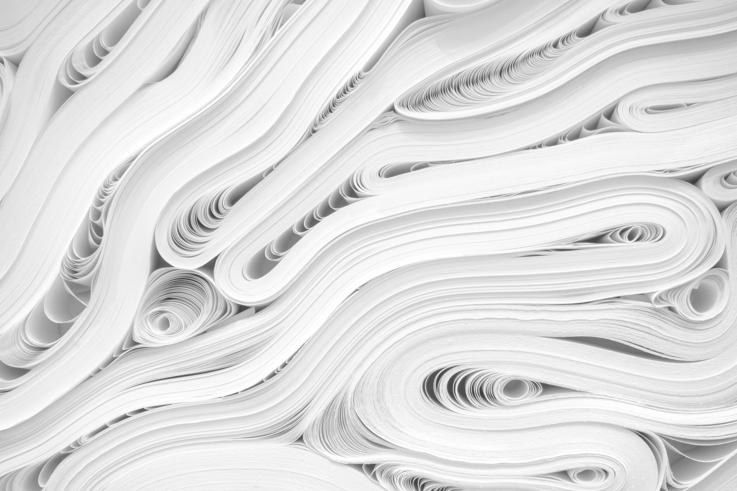
The Secret Life of Paper: How Substrate Structure Shapes Your Print
Ever wondered why the same design looks completely different on glossy versus matte paper? Or why some papers make colors pop while others make them whisper? Welcome to the hidden universe beneath your fingertips—where fiber networks, microscopic valleys, and invisible coatings orchestrate a complex performance that determines whether your print sings or falls flat!
When Colors Play Tricks: The Fascinating World of Metamerism
Ever had a client insist that the blue you printed doesn't match their logo? Or noticed how that perfect paint color in the store somehow transformed into something entirely different in your living room? Welcome to the maddening yet fascinating phenomenon of metamerism—where colors shape-shift before your very eyes, and no, you're not hallucinating!

Dots, Dithers, and Digital Magic: Unlocking the Secrets of Halftone Screening
Have you ever peered closely at a printed image with a loupe and discovered a hidden universe of tiny dots? Or wondered why some print work looks "smoother" than others? Today we're cracking open the laboratory doors to explore the fascinating world of halftone screening—the clever optical illusion that makes continuous tone reproduction possible in print!
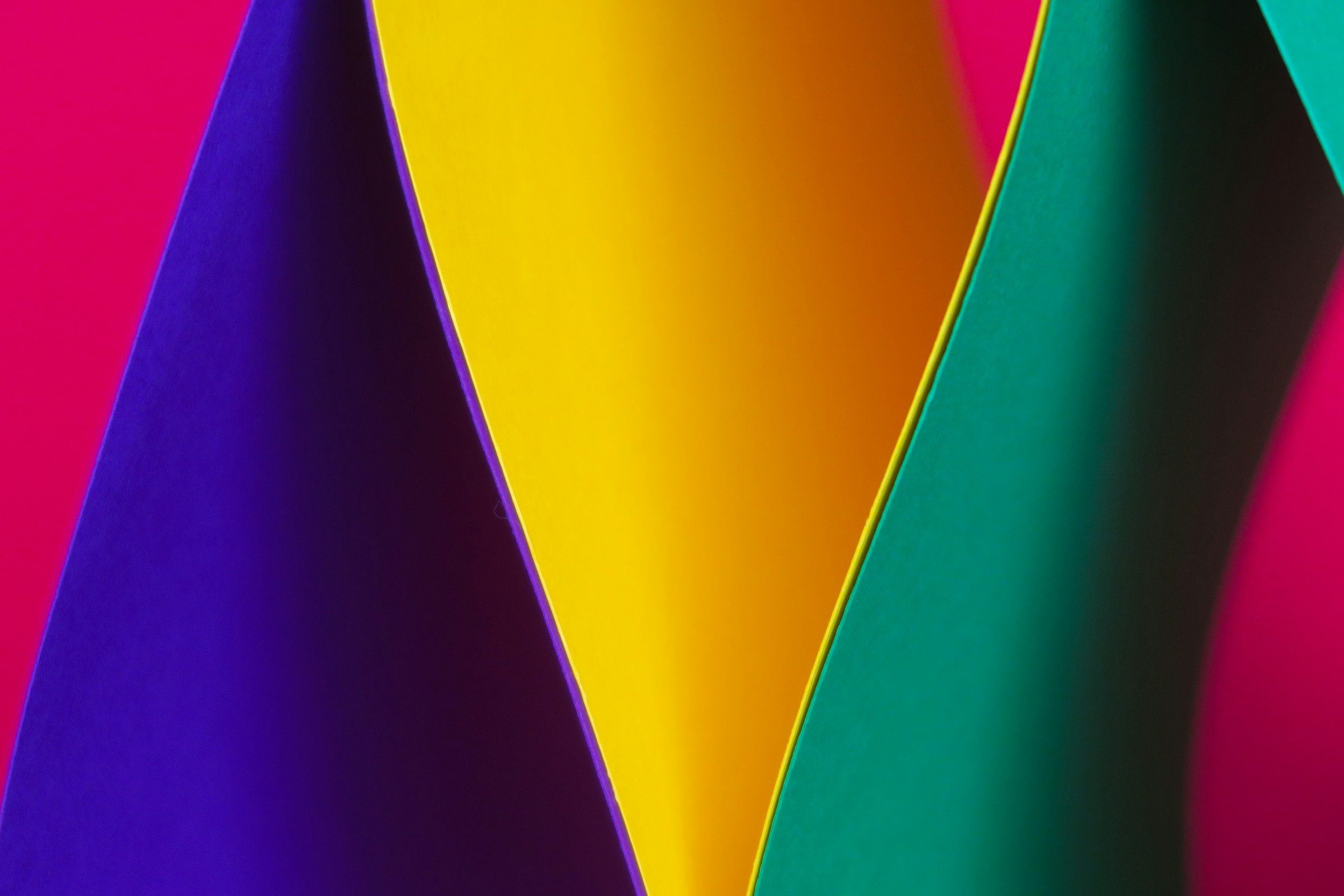
The Color Scientist's Guide: Understanding Hue, Saturation, Brightness, and Beyond
Ever noticed how some reds are fiery and others whisper? Or why that perfect blue on your screen becomes a sad purple in print? Welcome to the fascinating world of color dimensions—where understanding the fundamental building blocks of color can transform your design work from good to spectacularly precise. Ready to become a color scientist? Lab coat optional, curiosity required!
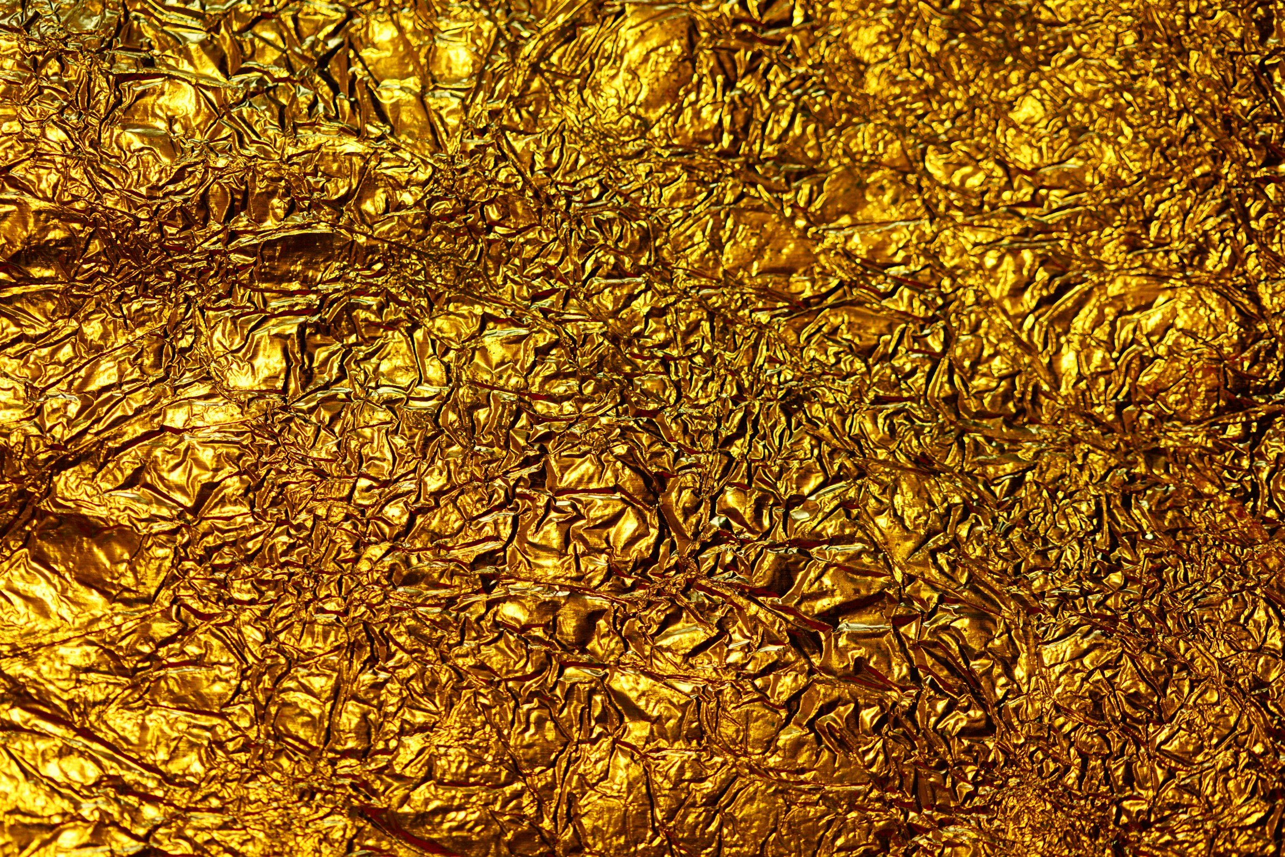
All That Glitters: The Fascinating Science of Foil Embellishment
Have you ever picked up a business card that caught the light just right, sending metallic reflections dancing across your vision? Or ran your fingers over a book cover where the title seemed to rise from the page in glimmering relief? Welcome to the dazzling world of foil embellishment—where chemistry, physics, and precision engineering combine to create surfaces that don't just catch the eye, they captivate it!

Standard Illuminants: The Unsung Heroes of Color Consistency
Have you ever selected the perfect shade of blue for a print project, only to have your client call in a panic because it looks "completely wrong" in their office? Or carefully color-matched across multiple substrates that somehow appear mismatched at the client presentation? You haven't committed a design crime—you've just stumbled into the mysterious realm of illuminants, where the very light that reveals your work can also fundamentally transform it.